Percent change vs year-ago change: reading the label
On this page
Two charts can be built from exactly the same data and still point in different directions, because each one compares the latest reading with a different earlier reading. This article looks at the two most common percent-change views, the ones offered on FRED graphs, explains why they diverge, and sets out the checks a chart reader should make before treating a spike as news.
Same data, two different questions
Most of the time a chart shows a level: the price of an asset, the value of an index, the dollar amount of some economic total. A percent-change chart does something else. It takes that level and turns it into a rate, asking how much the series moved relative to an earlier point. The choice of that earlier point is the whole story.
FRED, the free economic data service run by the Federal Reserve Bank of St. Louis, lets users switch the units of almost any series. Two of the options look nearly identical in the menu. One is labelled Percent Change. The other is labelled Percent Change from Year Ago. They answer two different questions, and the lines they draw can look nothing alike.
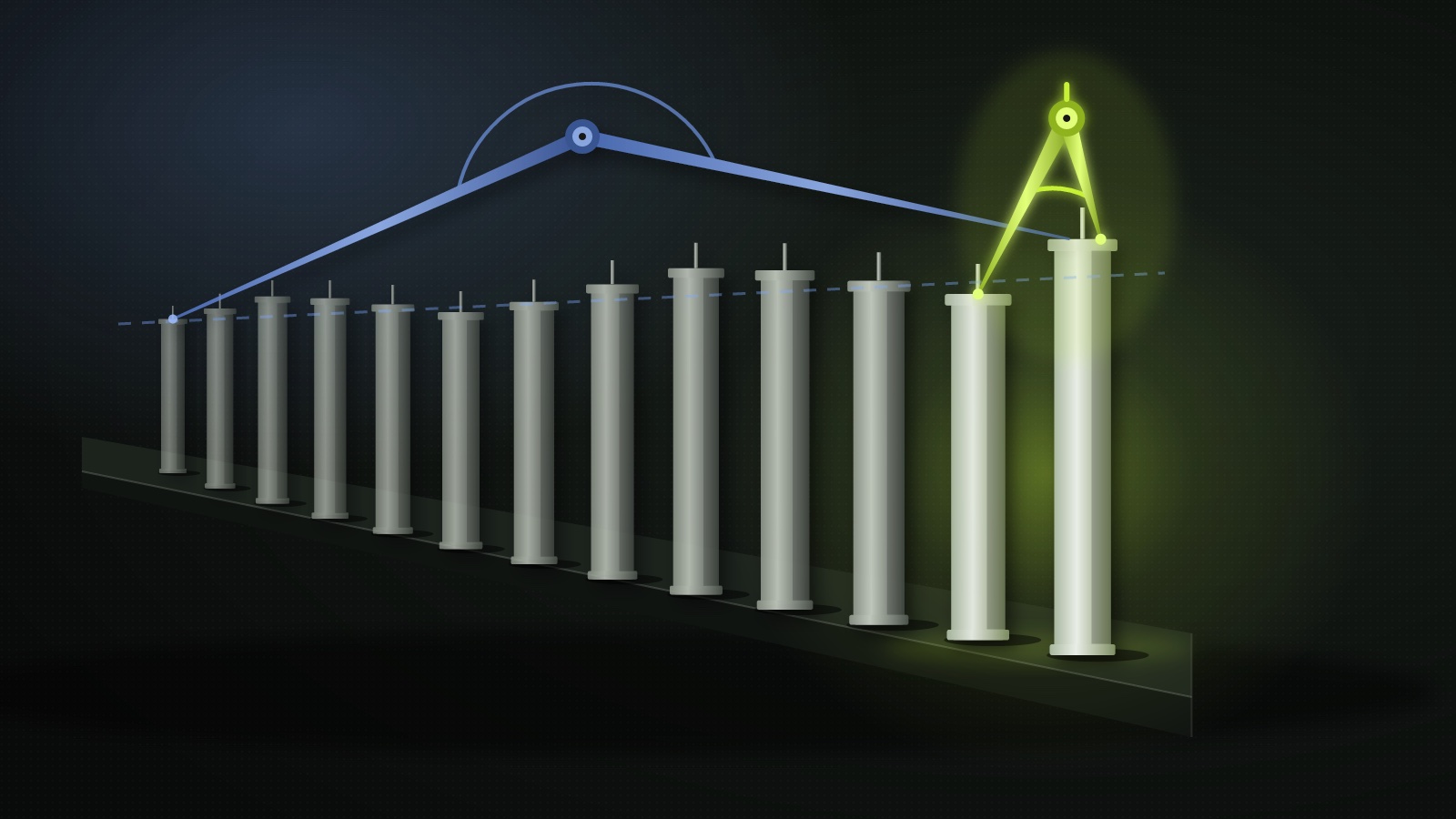
The Percent Change setting measures each observation against the one immediately before it. On a monthly series, that means this month against last month. On a quarterly series, this quarter against the previous quarter. The Percent Change from Year Ago setting measures each observation against the matching observation twelve months earlier: this October against last October, this quarter against the same quarter a year ago.
Why the two lines diverge
Because the comparison points differ, a month-on-month move and a year-on-year move of the same series can disagree while both charts remain correct. Neither is a mistake. They are simply measuring change over different windows.
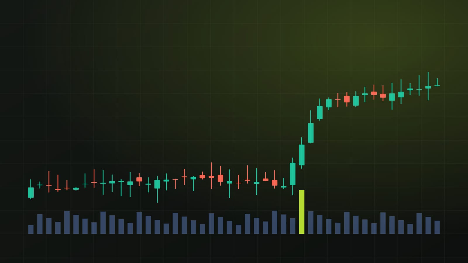
A short-window comparison reacts quickly. One unusual month shows up immediately as a sharp spike or dip, and the line tends to look noisy, jumping above and below zero. A long-window comparison is smoother, because each point folds in a full year of movement. It is slower to turn, and a single odd month changes it only a little.
That difference produces some common puzzles. A series can post a negative reading for the latest month while its year-ago line is still clearly positive, because the past year as a whole was a period of growth. The reverse also happens: a strong single month can appear while the year-ago comparison stays weak, because the level is still below where it was a year earlier.
There is also a base effect to keep in mind. A year-ago line depends on what happened a year before as much as on what is happening now. If the series was unusually low twelve months ago, today's year-ago change can look large even if recent months have been quiet. If it was unusually high, the opposite applies.
As the note that prompted this article put it: "A monthly move and a year-over-year move can therefore differ without either chart being wrong."
The height of the line is not the level
The second trap is subtler. Once a series is transformed, the line no longer shows the thing being measured. It shows a rate of growth. Read the axis this way: a point on a transformed line tells you how fast the series changed, not how big the series is, so the line's height never equals the dollar figure or index value behind it.
This matters when a percent-change line falls. A falling growth rate does not mean the level is falling. If the rate is still above zero, the underlying series is still rising, only more slowly than before. Only when the line crosses below zero is the level actually shrinking over that comparison window.
The same logic applies in reverse. A growth rate that climbs from deeply negative toward zero still describes a level that is declining, just at a gentler pace. Readers who skim the shape of the line without reading the axis can come away with the opposite impression of what the data say.
Three checks before reading a jump
The practical advice is short. Before interpreting a spike in a market or economic chart, check three things.
- The units label. Does the axis show a level, a percent change from the previous period, a percent change from a year ago, or something else such as an index rebased to a starting value? The label is usually small, and it is the most important text on the chart.
- The observation frequency. Is the series daily, weekly, monthly or quarterly? A percent change from the previous observation means very different things for a daily price series and for a quarterly economic total.
- The comparison period. Against which earlier point is each reading measured? The previous observation and the same point a year earlier give different answers, and neither is the full picture on its own.
None of these checks requires special software. They take a few seconds, and they prevent the most common misreadings of headline charts.
How this carries over to market charts
These ideas are not limited to economic releases. They apply to market charts too, whether the subject is a stock index, a single share or a cryptocurrency. Many charting tools let users switch between a price view and a percentage view, and many news graphics quote returns over a chosen window without saying much about the window itself.
A daily percent-change chart of an asset behaves like the short-window view described above: jumpy, quick to react, and easy to over-read. A return measured over a longer window behaves like the year-ago view: smoother, slower, and heavily influenced by where price stood at the start of the window. A strong-looking longer-window return can sit alongside a recent run of falling daily closes, and both descriptions can be accurate.
This is why Chartora's own articles state the window every time a change is quoted, and pair any percentage with the levels that matter on the daily chart: the nearest support and resistance zones, the trend structure of recent swing highs and lows, the position against the moving average and the place price sits inside its recent range. A percentage alone describes movement. The levels describe where that movement has left price.
What to watch when the next chart lands
Scheduled data releases are where the confusion appears most often. A headline may lead with the month-on-month figure while the chart beside it shows the year-ago rate, or the other way round. Reading the label first, then the frequency, then the comparison window, turns a confusing graphic into a clear one.
It also helps to look at the level chart alongside the transformed one. Seeing the underlying series makes it obvious whether a falling growth line reflects an actual decline or only a slower rise. The risk in skipping this step is not a small one: decisions based on a misread axis can be decisions based on the opposite of what the data show.
Sources
- Chartora Telegram channel · October 12, 2026
Written with AI assistance from the reports named above and Chartora's own chart data. Figures, quotes and sources are checked automatically before publishing.
For education only, not financial advice. Crypto assets and stocks are volatile, and leveraged positions can lose more than the money you put in.
Get one like this every week
A five-minute market brief in your inbox each Monday. Free, unsubscribe anytime.
Chart notes during the week on Telegram: @isoskwllsMarket now
Latest news