Rebased charts: what lines that start at 100 really show
On this page
Many comparison charts put every line on the same starting value of 100, and the economic data platform FRED offers a tool that does exactly this. A Chartora explainer published on 2026-10-12 set out what such a chart can and cannot tell you. This article goes further: how rebasing works, where it misleads, and a short checklist for reading one honestly.
What rebasing does to a chart
FRED, the free economic data service, has an Index transformation. When you pick several data series and apply it, each one is set equal to 100 on a date you choose. Every later point is then shown relative to that line's own value on the base date.
The result is a chart where all lines begin at the same spot. That is the whole point. Series that normally live on very different scales, such as a price in dollars, a count of jobs or an index of output, can sit side by side and be compared by shape alone.
The same idea appears well beyond economic data. Traders often rebase a stock, an exchange-traded fund and a cryptocurrency to a common start so they can see which one has grown faster over a period. Many charting tools call this a percentage or comparison view. The arithmetic underneath is the same.
Reading the numbers: growth, not size
The key to a rebased chart is that each reading is a ratio to its own past. As the Chartora explainer put it, a line that later reads 120 has risen 20% from its value on the base date. A second line that reads 110 has gained 10% from its own starting point.
That tells you something useful: the first series grew faster than the second over that stretch. It tells you nothing about which one is bigger. The higher indexed reading does not mean the first measure sits at a larger absolute level. A small company's share price and a giant company's share price can both start at 100. The small one can end higher on the chart while remaining far smaller in market value.
Put simply, a rebased chart answers one question: how much has each thing changed since this date? It does not answer a different one: how large is each thing? Mixing up those two questions is a common mistake readers make with this kind of chart.
Why the base date matters so much
The second caveat is subtler. Because every line is pinned to 100 on one chosen day, the choice of that day shapes everything that follows. In the explainer's words, "the chosen start date can change the visual story".
Imagine two assets that moved very differently over a year. If you set the base date at a point where one of them had just fallen sharply, that asset starts from a low point. Its later recovery will look strong on the chart. Move the base date to just before the fall, and the same asset can look like a laggard. Nothing about the underlying data changed. Only the anchor moved.
This matters for market charts in particular. Crypto assets and growth stocks can swing widely within weeks. A comparison that starts at a local low or a local high can exaggerate or hide a difference in performance. When someone shares a rebased chart to make a point, the base date is often the quiet choice that makes the point look stronger.
- A base date right after a sell-off flatters the asset that fell hardest.
- A base date at a peak makes the asset that peaked look weak for a long time.
- A short window can make a brief divergence look like a lasting trend.
None of this makes rebasing wrong. It makes the base date part of the evidence, and it deserves the same scrutiny as the lines themselves.
How this applies to price charts
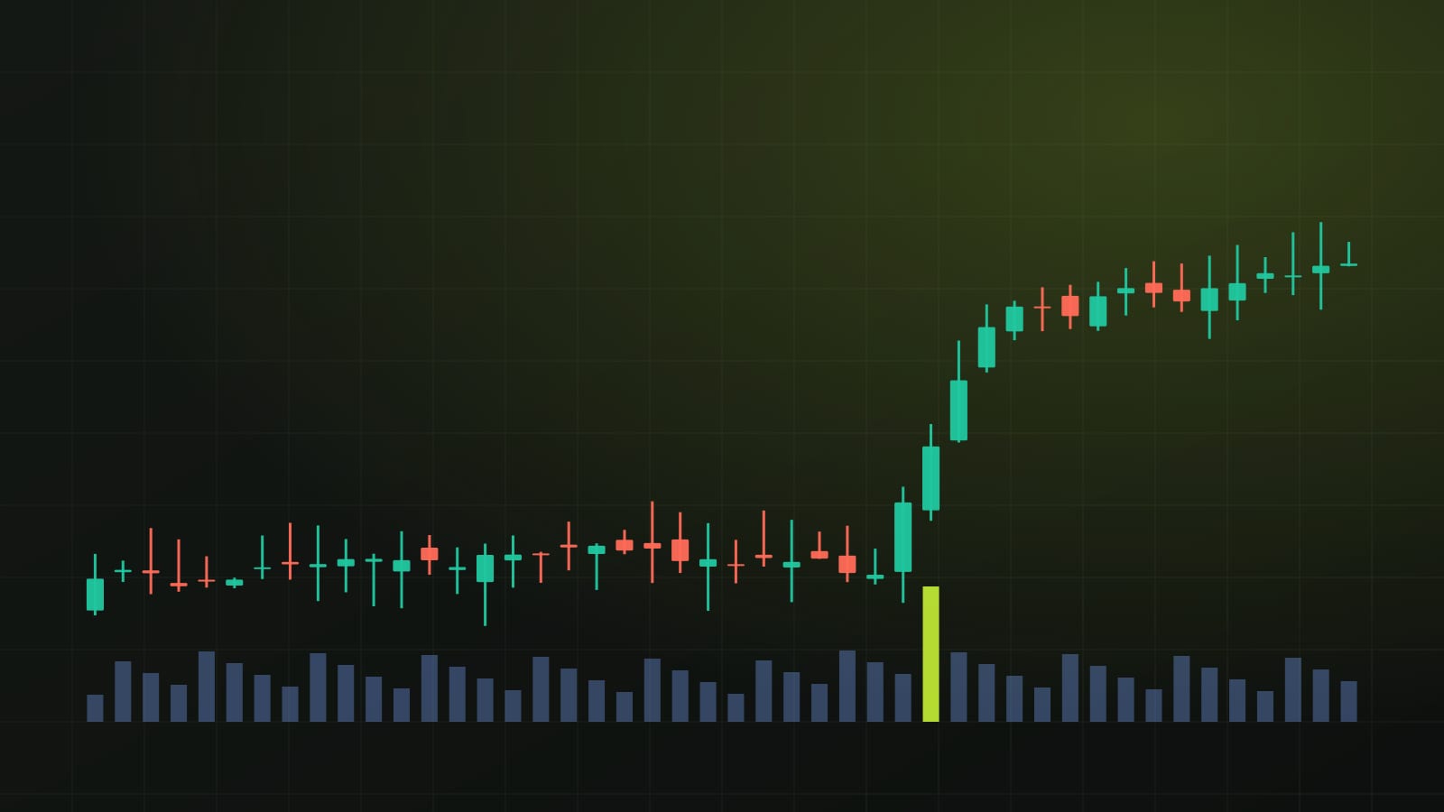
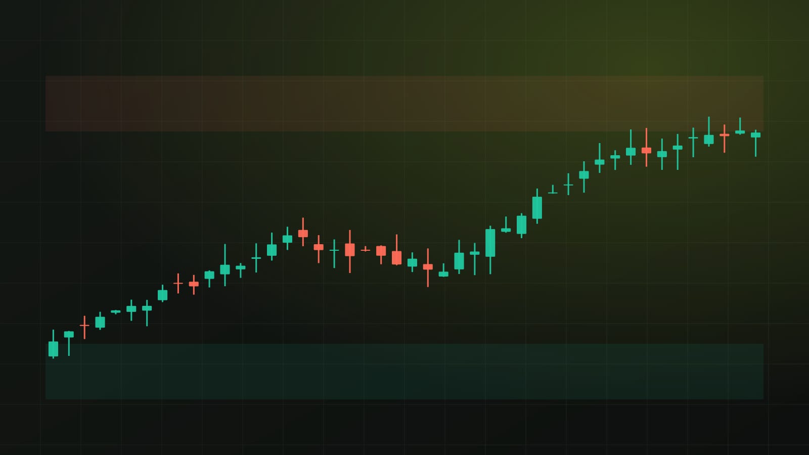
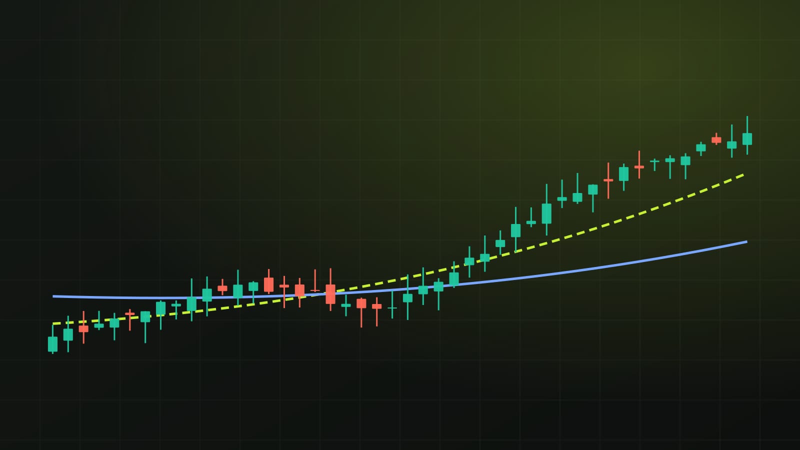
Chartora normally reads a single asset on its own daily chart: support and resistance, trend structure, moving averages and where price sits in its recent range. Those tools work on actual prices, not on an index. A rebased chart is a different instrument. It is good for comparing assets, and weak for judging any one of them.
For example, if a chart shows bitcoin and a large stock index both rebased to 100, you can see which gained more since the base date. You cannot see where either one sits against its own support or resistance, because those levels exist in price terms. Nor can you see volume, which often helps confirm whether a move had broad participation.
There is also a risk in reading a rebased gap as a signal. A line that has pulled ahead on a comparison chart has outperformed in the past. It says nothing about the next move, and a wide gap can close quickly in either direction when conditions change. Treat the chart as a record of relative change, not a forecast.
A short checklist before trusting the gap
The Chartora explainer offered two practical checks, and they are worth turning into a habit. First, look for the base date before drawing any conclusion from the distance between lines. Second, look at the original units of each series before treating the visual gap as a real economic difference.
- Find the base date. Ask why that date was chosen and whether a nearby date would tell a different story.
- Check the original units. A rebased line hides whether a series is measured in dollars, tokens, people or an index of its own.
- Read the gap as relative growth only. A higher line grew faster since the base date; it is not necessarily bigger.
- Look at the actual price chart too. Levels, trend and volume live there, not on the comparison view.
- Notice the window length. Short windows exaggerate noise; long windows can bury recent shifts.
These checks take a minute. They protect against the most common ways a clean-looking comparison chart can lead a reader to the wrong conclusion.
What to keep in mind next time
Rebased charts are everywhere: in research notes, in social media posts, in fund marketing and in economic dashboards like FRED. They are popular because they make different things comparable at a glance. That same convenience is why they can mislead.
When you meet one, slow down and read it in two steps. Start with the setup: which series, which base date, which original units. Then read the lines as growth paths, nothing more. If the conclusion survives a different base date and still makes sense in the original units, it is probably a fair one. If it only works from one carefully chosen starting point, treat it with caution.
Sources
- Chartora Telegram channel · October 12, 2026
Written with AI assistance from the reports named above and Chartora's own chart data. Figures, quotes and sources are checked automatically before publishing.
For education only, not financial advice. Crypto assets and stocks are volatile, and leveraged positions can lose more than the money you put in.
Get one like this every week
A five-minute market brief in your inbox each Monday. Free, unsubscribe anytime.
Chart notes during the week on Telegram: @isoskwllsMarket now
Latest news