Moving averages explained: the 20, 50 and 200-day lines
On this page
A moving average is the most common line drawn over a price chart. It does one job: it turns a jagged series of closes into a smooth line. That smoothing is useful, and it has a cost — every moving average is late.
What a moving average is
A simple moving average (SMA) is the average of the last N closing prices. Each day the newest close joins the window and the oldest drops out, so the average “moves” along the chart.
Assume a stock closes at $10, $11, $12, $11 and $13 over five days. The five closes add up to $57, so the 5-day average is $11.40. If day six closes at $16, the $10 drops out and the window becomes $11, $12, $11, $13 and $16. The average rises to $12.60.
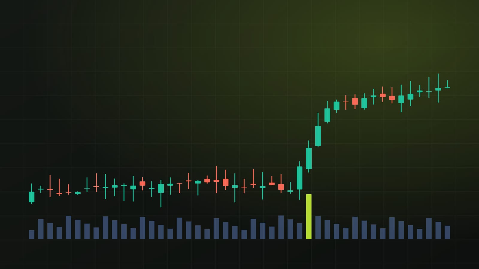
Price jumped about 23% in one day; the average moved $1.20 and still sits $3.40 below price. That gap is the lag, and it is built into the method. Put another way, the closes inside a 50-day average are on average 24.5 days old, and those inside a 200-day average 99.5 days old.
Simple vs exponential
An exponential moving average (EMA) gives more weight to recent closes. Each day it moves a fixed fraction of the way toward the latest close; for an N-day EMA that fraction is 2 ÷ (N + 1).
In the example above, a 5-day EMA moves one third of the way each day (2 ÷ 6). Starting from the simple average of $11.40, a $16 close lifts it to $12.93, about $0.33 closer to price than the SMA.
- SMA: every close in the window counts equally. In a 50-day SMA the newest close carries 2% of the weight, and a close drops out completely after 50 days.
- EMA: the newest close carries more weight, about 3.9% in a 50-day EMA, and older closes fade gradually instead of dropping out.
Neither is better. The EMA turns sooner and also reacts more to noise; the SMA is steadier and slower. Using the same one consistently matters more than the choice.
The 20, 50 and 200-day lines
The periods are conventions, not laws. They became popular because many people watch them, which is part of why price sometimes reacts near them.
- 20-day: roughly a month of US trading days; a short-term line that stays close to price.
- 50-day: about two and a half months of trading; a common medium-term reference.
- 200-day: close to a year of trading days (a year has about 252); the line most often used to describe the long-term trend.
On stock charts these are trading days. Crypto trades every day, so a 50-day average of daily closes covers 50 calendar days.
Where price sits relative to an average is a plain description of the recent past. Price above a rising 200-day average is higher than its average of roughly the last year; price below a falling one is lower. The slope of the line usually says more than a single close on either side of it, because in a sideways market price crosses the average back and forth many times.
Golden cross and death cross
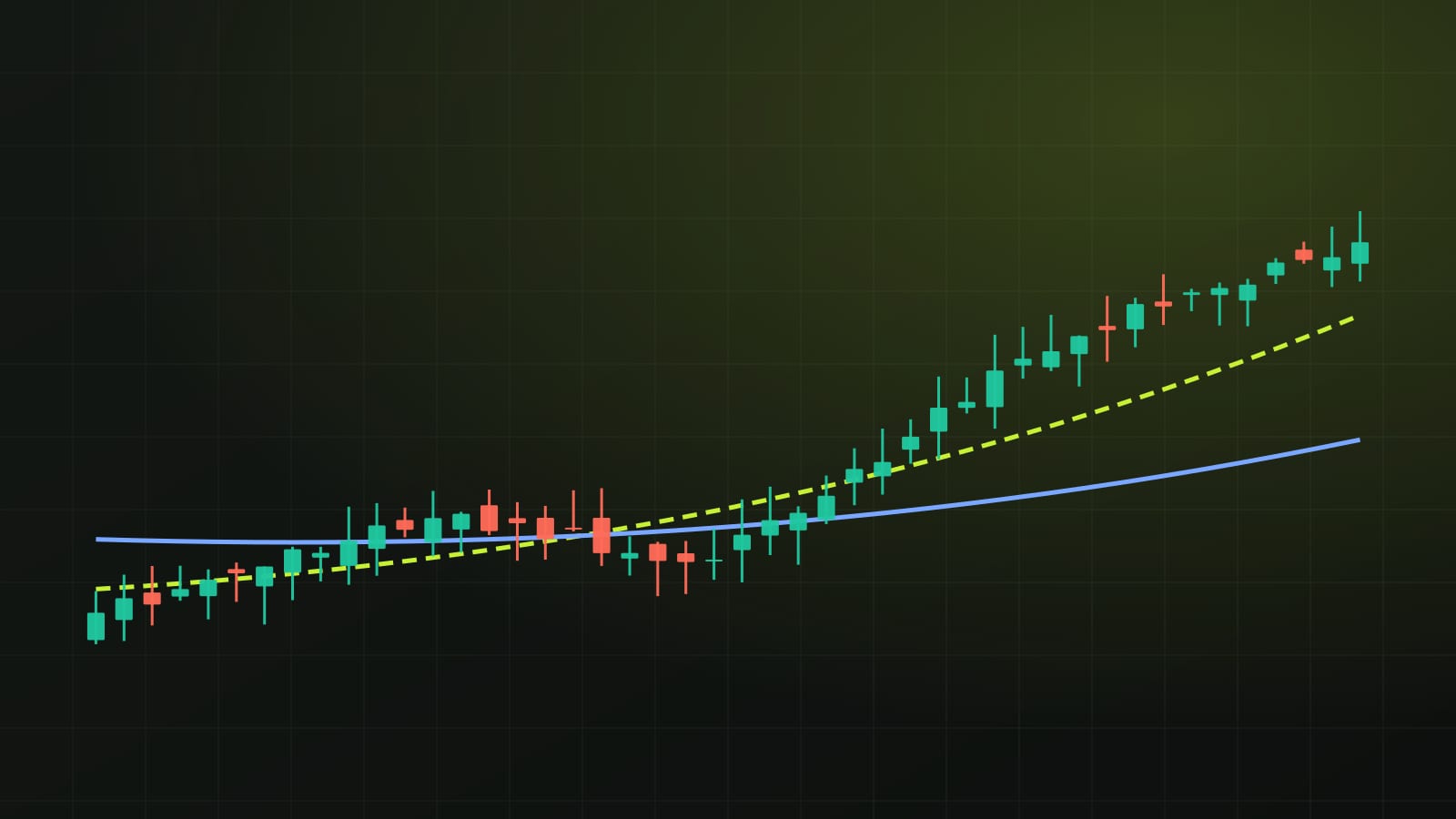
A golden cross is when the 50-day average crosses above the 200-day average; a death cross is when it crosses below. Both make headlines because they are easy to spot.
Both are built from two lagging lines, so they arrive after much of the move has already happened. A cross confirms what price has done; it does not predict what it will do next. In a sideways market the two averages can cross back and forth several times, producing signals that go nowhere.

How Chartora’s desk uses the 50-day average
The chart desk on our home page draws one average: the simple 50-day average of daily closes, shown as a dashed line over the last 90 days. The desk states how far the latest close sits above or below that average, and the levels board shows the same gap for every coin we cover.
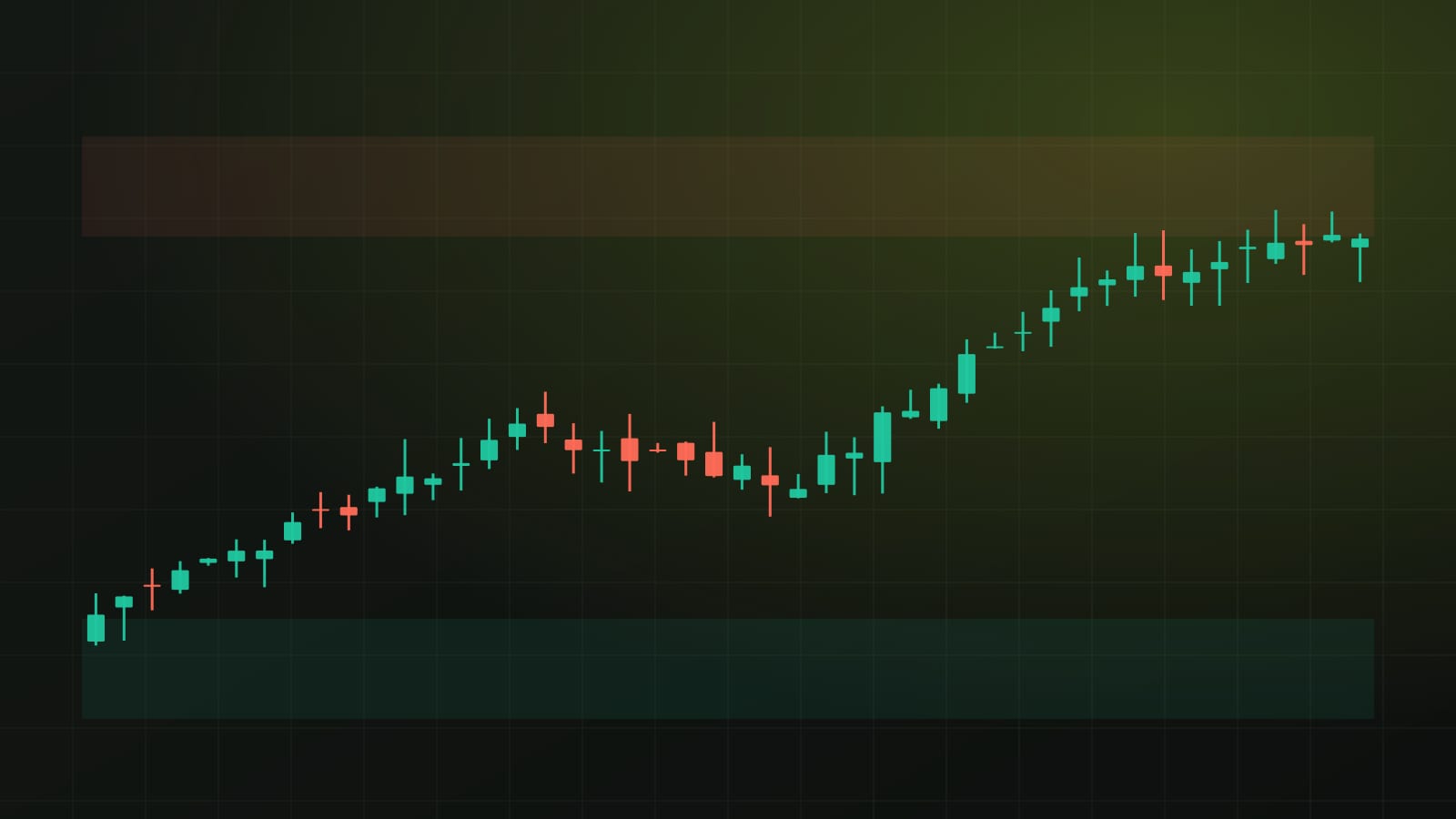
We treat it as a reference, not a signal. It answers one question: is price higher or lower than its average of the last 50 closes, and by how much? The support and resistance levels come from swing highs and swing lows in the closes, not from the average, and the desk does not mark crossovers.
For education only, not financial advice. Crypto assets and stocks are volatile, and leveraged positions can lose more than the money you put in.
Get one like this every week
A five-minute market brief in your inbox each Monday. Free, unsubscribe anytime.
Or follow the Telegram channel @isoskwllsMarket now
Latest news